Directly below are a few select monthly email campaigns where I did the art direction, design, illustrations, and photography needed to bring each campaign idea to life.
An isometric illustration of a town made of t-shirt architecture, using original concepts from Clockwise’s own iconography including their logo, branded box’s, trucks, and much more. This was used on the front of a physical mailer, inside of a branded notebook, and on inserts in every outgoing box.
A short video that I animated as well as put sound effects to for use in instagram reels and youtube ads. Also featuring a logo animation at the end. (scaled differently for viewing purposes on this website)
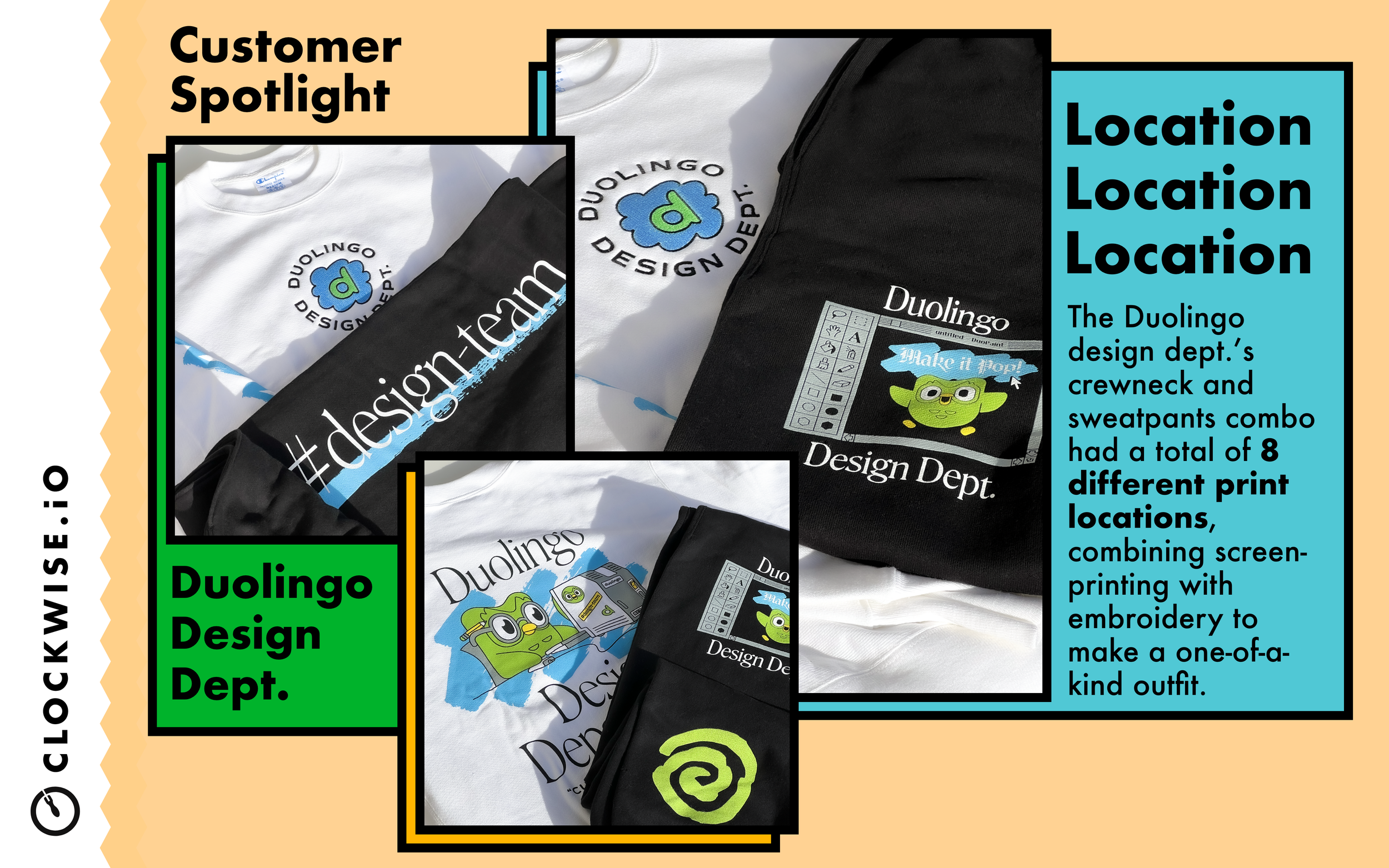
2-slide “stitched” Instagram post showcasing custom garments with many decoration locations. Featuring brand colors. Design, staging, and photography.
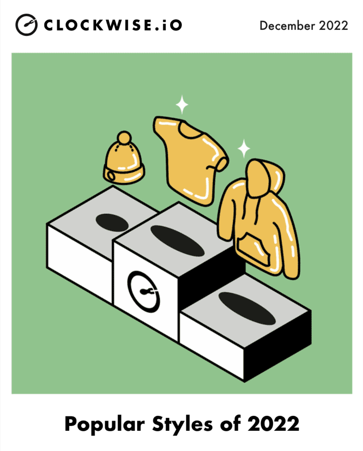
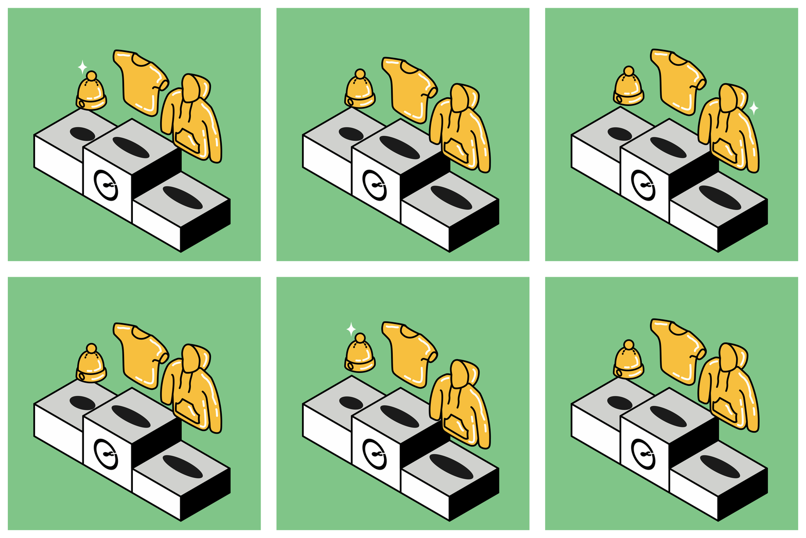
Hero image made for a “top garments of the year” email.
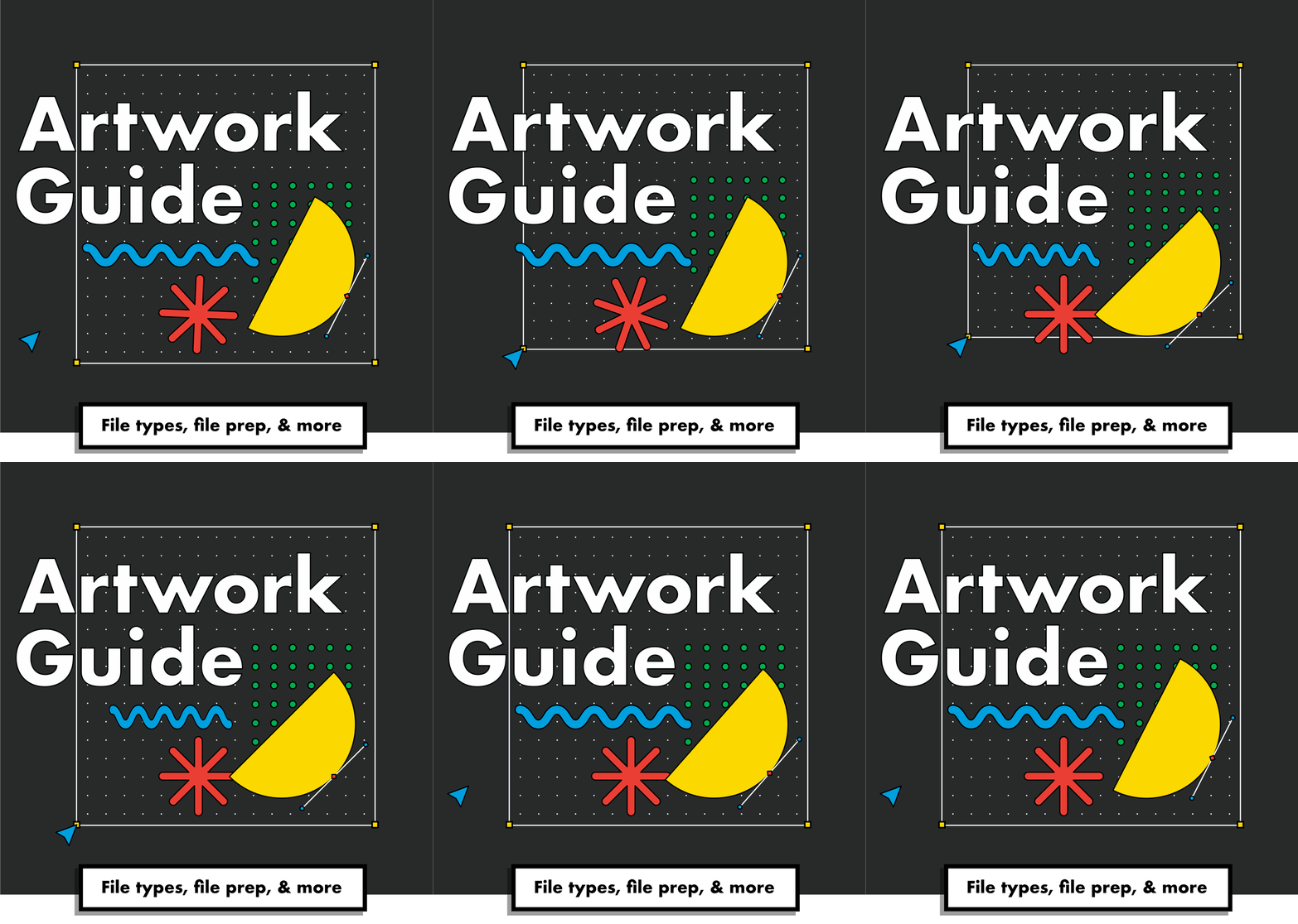
Hero image made for the “Artwork Guide” email.
A gift box that I designed and curated with objects I had created using existing brand assets as well as new designs. New Items are regularly added and swapped out to keep things feeling fresh.
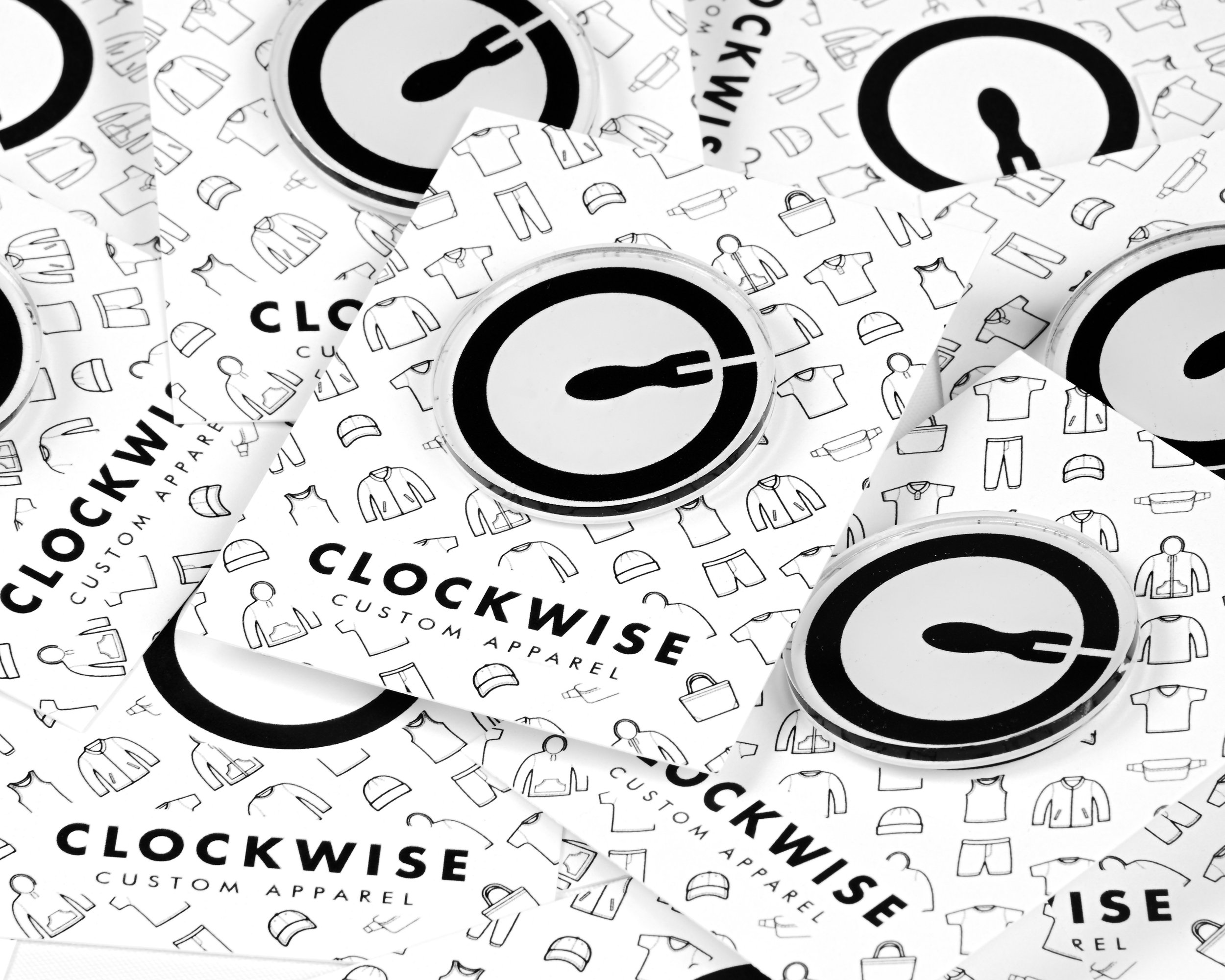
Card that holds an acrylic pin of our company logo, doubling as a business card with information on the back designed carefully around the pin hole/stopper.
For this video, I took our existing static icons and animated them to create a fun new narrative. The truck moving left to right with the Clockwise logo spinning shows that we are always moving forward while the billboards call out our main services.


